
Performance Measures: A Practical Guide for Teams

Performance measures are the defined, measurable signals an organization uses to track progress toward its goals. Get that definition right from the start, and everything else, including which data to collect, how often, and who owns it, becomes much easier to decide.
Before you pick a single measure, it helps to understand three related terms that practitioners often use interchangeably but shouldn’t. According to Klipfolio’s hierarchy, a measure is raw data (units produced, calls answered), a metric puts that data in context as a rate or ratio (calls answered per hour), and a key performance indicator (KPI) is a metric tied directly to a strategic target. Think of it as a ladder: measures sit at the bottom, KPIs at the top.
Three steps you can take right now:
- Clarify the objective first. Write one sentence describing what success looks like for the unit or program you’re evaluating. The Balanced Scorecard and SMART criteria both start here, and for good reason.
- Pick 1–3 candidate measures. Choose measures that are directly observable, not proxies three steps removed from the outcome you care about.
- Set a reporting frequency. Weekly, monthly, or quarterly? The answer depends on how fast the underlying process moves, not on how often leadership wants a report.
Key Takeaways
Effective performance measures require clear definitions, named ownership, and a governance cadence that keeps them aligned with strategy as priorities shift.
| Point | Details |
|---|---|
| Measures, metrics, and KPIs differ | A measure is raw data; a metric adds context as a rate or ratio; a KPI ties a metric to a strategic target. |
| Keep KPIs lean | Limit each business unit to roughly 5–10 vital KPIs to preserve focus and clear accountability. |
| Write the measurement plan first | Document the formula, data source, frequency, and named owner before collecting a single data point. |
| Pair leading and lagging indicators | Lagging indicators confirm outcomes; leading indicators give you time to course-correct before damage shows up. |
| Designflow-build automates data collection | Contractors report a significant reduction in manual data entry, giving KPIs a cleaner, more reliable data foundation. |
Table of Contents
- What are the main types of performance measures?
- What do performance measures look like across different sectors?
- How do you design and select effective performance measures?
- How do you make your measures trustworthy?
- What are the most common performance measurement mistakes?
- Which frameworks and tools support performance measurement?
- A real-world construction example: from noisy data to focused KPIs
- Your 30–60–90 day action plan
- The case for starting small and governing well
- Fewer manual steps, better measurement data
- Sources
What are the main types of performance measures?
Performance measures fall into several overlapping taxonomies. Understanding each one helps you choose the right measure for the right purpose, rather than defaulting to whatever data is easiest to pull.
Strategic, operational, and functional
Investopedia’s KPI breakdown categorizes KPIs by organizational purpose: strategic measures track overall organizational health (revenue growth, market share), operational measures focus on short-term process performance (order fulfillment time, defect rate), and functional measures track department-level goals (HR turnover rate, finance days-payable-outstanding). That three-level split matters because a measure appropriate for a board report is rarely the right one for a field supervisor’s daily check.
Leading vs. lagging indicators
A lagging indicator confirms what already happened: net profit margin, customer churn rate, project completion percentage. A leading indicator signals what is likely to happen: pipeline value, employee engagement score, safety near-miss count. Most organizations over-rely on lagging indicators because the data is cleaner and easier to defend. The practical fix is to pair every lagging KPI with at least one leading counterpart so you can course-correct before the damage shows up in the final numbers.
Input, activity, output, and outcome
The logic chain looks like this:
Input → Activity → Output → Outcome
Example: Budget allocated (input) → training sessions delivered (activity) → employees trained (output) → reduction in error rate (outcome).
Measuring only outputs is common and misleading. A program that trains 500 people but sees no change in error rates has a strong output measure and a weak outcome measure. Both numbers belong in the report.
Objective vs. subjective measures
ASQ’s guidance on metrics is direct: objective measures (counts, rates, durations) are more repeatable and easier to automate than subjective measures (survey scores, manager ratings). Use objective measures as your foundation. Subjective measures add context, especially for culture, satisfaction, and perception, but they require stronger governance to stay consistent across raters and time periods.
Pro Tip: When you can’t find a fully objective measure for an outcome you care about, use a proxy that is objective and document its limitations explicitly. “Average customer satisfaction score from a standardized 5-question survey, monthly” is far more defensible than “how happy customers seem.”
NIST’s classification framework adds further dimensions worth knowing: intrinsic vs. relative, basic vs. derived (computed from other measures), and static vs. dynamic. These distinctions guide your choice of units and collection method before you write a single formula.
What do performance measures look like across different sectors?
Concrete examples make abstract categories real. The following sector lists use a consistent wording template: Measure name = numerator / denominator, reported [frequency], owned by [role].
Program and government
- On-time service delivery rate = services delivered on schedule / total services delivered, monthly, Program Director
- Cost per beneficiary = total program cost / number of beneficiaries served, quarterly, Finance Lead
- Outcome achievement rate = participants meeting target outcome / total participants, semi-annually, Program Manager
The U.S. Treasury’s IT Performance Measures Guide provides federal reporting templates that program managers can adapt directly for grant-funded or agency-level measurement.
Business
- Revenue per employee = total revenue / headcount, quarterly, CFO
- Customer acquisition cost = total sales and marketing spend / new customers acquired, monthly, Marketing Lead
- Gross margin = (revenue minus cost of goods sold) / revenue, monthly, CFO
HR
- Voluntary turnover rate = voluntary separations / average headcount, monthly, HR Director
- Time-to-fill = calendar days from job opening to accepted offer, per hire, Talent Acquisition Lead
- Training completion rate = employees completing required training / total employees, quarterly, L&D Manager
For construction-specific workforce metrics, recruiting cost strategies for hiring managers offer practical benchmarks for time-to-fill and cost-per-hire in the trades.
Education
- Student pass rate = students passing course / total enrolled, per term, Academic Dean
- Attendance rate = days attended / total school days, monthly, Principal
- Graduation rate = students graduating on time / cohort enrolled four years prior, annually, Superintendent
Construction
- Schedule performance index = earned value / planned value, weekly, Project Manager
- Rework rate = rework hours / total labor hours, monthly, Site Superintendent
- Safety incident rate = recordable incidents × 200,000 / total labor hours, monthly, Safety Officer
How do you design and select effective performance measures?
A repeatable design process prevents the most common failure mode: choosing measures because the data already exists rather than because the measure actually tracks what matters.
- Clarify the strategic objective. Write one sentence: “We will achieve [outcome] by [date] as measured by [indicator].” MIT’s research on performance measurement pitfalls calls this “success mapping,” and it should happen before any data discussion.
- Map the outcome chain. Trace the input → activity → output → outcome logic for your program or business unit. Identify where the biggest uncertainty sits; that is usually where your leading indicator belongs.
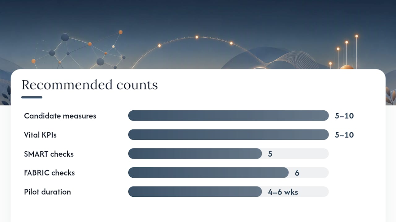
- Generate 5–10 candidate measures. Brainstorm with the team that owns the process. Frontline staff often know which data is actually reliable and which is routinely fudged.
- Apply the SMART and FABRIC filters. For each candidate, ask: Is it Specific, Measurable, Achievable, Relevant, and Time-bound? Then check FABRIC: Focused, Appropriate, Balanced, Robust, Integrated, Cost-effective. Drop any measure that fails more than two criteria.
- Write the measurement plan. For every surviving measure, document: exact calculation formula, data source, timestamp convention, reporting frequency, and named owner. ICAEW’s KPI guide is clear that this plan is as important as the KPI choice itself. Without it, two people will calculate the same KPI differently and spend meetings arguing about whose number is right.
- Run a 30–90 day pilot. Collect data, review it with stakeholders, and check whether the measure actually moves when the underlying process changes. If it doesn’t, it’s not measuring what you think it is.
How many measures should you keep? ICAEW recommends limiting each business unit to roughly 5–10 vital KPIs. More than that and attention fragments. A lean set forces prioritization and makes accountability clearer.
Pro Tip: Pilot your measurement plan before committing to it. Collect 4–6 weeks of data, then ask: “Did this number change when we expected it to?” If the answer is no, the measure is either lagging too far behind the process or capturing the wrong variable. Validate before you automate.
Results-Based Accountability (RBA), popularized by ClearImpact, structures this design process around three questions: How much did we do? How well did we do it? Is anyone better off? Those three questions map cleanly onto output, quality, and outcome measures, and they work equally well for government programs and private-sector teams.
How do you make your measures trustworthy?
A measure is only as good as the data behind it. These five checks apply before you report any figure to a decision-maker.
- Completeness: Are there gaps in the data? Missing records skew rates. Document the gap rate alongside the measure itself.
- Consistency: Is the same term defined the same way across all data sources? “On-time” means nothing until you specify: on-time to what milestone, measured from what timestamp.
- Timeliness: Is the data available when the decision needs to be made? A monthly safety report that arrives six weeks after month-end is useless for course correction.
- Provenance: Can you trace each data point to its source system? Measures built on manually entered spreadsheet data are fragile. ASQ’s metrics guidance recommends grounding systems in objective, automatable measures precisely because manual entry introduces systematic error.
- Verifiability: Could an independent reviewer reproduce the calculation from the raw data? If not, the measure will not survive an audit or a leadership challenge.
Setting baselines and targets
A baseline is your starting point: the average of the last 3–6 periods before any intervention. Without a baseline, you cannot tell whether a number is good, bad, or just normal variation.
Raw measures often need normalization before they are comparable across projects or time periods. A construction site that logs 12 safety incidents in a month looks worse than one that logs 4, until you normalize by labor hours. Expressed as incidents per 200,000 labor hours, the larger site may actually have a better safety record. Always normalize by a meaningful denominator before comparing across units.
One statistical caution: small sample sizes produce volatile rates. That number is technically correct and practically meaningless. When sample sizes are small, report the raw count alongside the rate and avoid drawing trend conclusions from fewer than three periods of data.
What are the most common performance measurement mistakes?
Most measurement failures are predictable. Here are the ones that appear most often, with a one-line fix for each.
- Confusing the indicator for the performance itself. A rising KPI is a signal, not proof of success. Fix: always pair the KPI with a qualitative review of what drove the change.
- Tracking too many KPIs. Fifty metrics on a dashboard means no one is accountable for any of them. Fix: cut to 5–10 per unit and review the rest quarterly.
- Measuring what’s easy, not what matters. Teams default to data that already exists. Fix: start with the outcome you need, then find or build the measure.
- No named owner. A measure without an owner is never updated and never acted on. Fix: every KPI gets one named person responsible for data quality and response.
- Undefined calculation rules. “On-time” means different things to different teams. Fix: write the exact formula in the measurement plan before the first data pull.
- Gaming. When a measure becomes a target, people optimize the measure rather than the underlying process (Goodhart’s Law). Fix: rotate measures periodically and pair quantitative KPIs with qualitative checks.
- No baseline. Reporting a number without context tells you nothing. Fix: establish a 3–6 period historical baseline before reporting any trend.
- Ignoring leading indicators. Over-reliance on lagging data means you react after the damage is done. Fix: pair every lagging KPI with one leading counterpart.
- Misaligned reporting frequency. Reporting a fast-moving process monthly, or a slow-moving one weekly, creates noise. Fix: match frequency to the pace of the underlying process.
- No review cadence for the measures themselves. Business priorities shift; measures should too. Fix: schedule a quarterly “measure health check” to retire stale KPIs and add new ones.
Red flags on a dashboard: every metric is green, no measure has changed in three months, or the same person both collects and reports the data without independent review.
Which frameworks and tools support performance measurement?
Three frameworks worth knowing
The Balanced Scorecard, developed by Kaplan and Norton, organizes measures across four perspectives: financial, customer, internal processes, and learning and growth. Its core value is preventing organizations from optimizing only for financial results at the expense of the capabilities that generate them. It suits strategic reporting at the executive and board level.
The Performance Prism, developed at Cranfield School of Management, adds two dimensions the Balanced Scorecard omits: stakeholder contribution (what stakeholders owe the organization) and stakeholder satisfaction (what the organization owes stakeholders). It works well when an organization has complex, multi-directional stakeholder relationships, such as a public agency or a joint venture.
Results-Based Accountability (RBA), supported by ClearImpact, is built for program-level measurement in government and nonprofit contexts. Its three-question structure (how much, how well, is anyone better off?) makes it accessible to teams with limited measurement experience and produces measures that are directly tied to community-level outcomes.
| Framework | Best use case | Reporting level |
|---|---|---|
| Balanced Scorecard | Aligning strategy across four organizational perspectives | Strategic |
| Performance Prism | Multi-stakeholder environments with complex accountability | Strategic / Operational |
| Results-Based Accountability | Program and community outcome measurement | Operational / Program |
Tooling categories
- Business intelligence platforms (Power BI, Tableau, Looker): aggregate data from multiple sources and visualize trends. Best for organizations with clean, centralized data.
- Performance management platforms (Workday, SAP SuccessFactors): track HR and organizational KPIs with built-in benchmarking. Best for people-focused measures at scale.
- Project and operational ERP systems: capture transactional data at the source, including labor hours, costs, and schedule variances, and feed it directly into KPI calculations without manual extraction. For construction teams, this is where operational KPI tracking becomes practical rather than theoretical.
The key integration principle: your governance layer (who owns each measure, at what frequency, with what calculation rule) must be defined before you configure any tool. A dashboard built on undefined measures just automates the confusion.
For teams moving away from spreadsheets, replacing Excel with an integrated system removes the single biggest source of data inconsistency in operational measurement.
A real-world construction example: from noisy data to focused KPIs
A mid-size general contractor with roughly 80 field staff was tracking more than 30 project metrics across disconnected spreadsheets. Project managers reported schedule performance differently depending on which template they used. Safety data arrived two weeks after the reporting period. Cost variance figures were recalculated manually each month, and two project managers consistently produced different numbers for the same job.

Before: 30+ metrics, manual entry, no named owners, no standardized calculation rules, two-week data lag on safety.
After: 8 KPIs per project (schedule performance index, cost performance index, rework rate, safety incident rate, subcontractor on-time delivery, change order cycle time, cash flow variance, and punch list completion rate), automated from a single ERP data source, with a named owner and a written measurement plan for each.
The headline results: data lag dropped from two weeks to same-day for field measures, and the time project managers spent compiling reports fell sharply once data collection was automated. Construction project automation made the difference between a measurement system that was consulted and one that was ignored.
Lessons from that transition:
- Governance first. The team spent two weeks agreeing on calculation definitions before touching any software. That investment prevented the “whose number is right” argument from recurring.
- Stakeholder buy-in is not optional. Field supervisors who understood why the measures existed entered data more accurately than those who saw it as administrative overhead.
- Start with eight, not thirty. Cutting from 30 metrics to 8 KPIs felt like losing information. Within 90 days, the team agreed they were making better decisions with fewer, cleaner numbers.
- Automate collection, not just reporting. Automating the dashboard while leaving data entry manual just speeds up the wrong part of the process.
For project managers looking to build this kind of discipline into their daily workflow, the construction project manager career guide outlines how quantitative performance data fits into the role’s core responsibilities.
Your 30–60–90 day action plan
Getting a measurement system off the ground does not require a six-month consulting engagement. Here is a prioritized sequence.
- Days 1–30: Foundation. Clarify your top 3 strategic objectives in writing. Map the outcome chain for each. Generate 5–10 candidate measures per objective and apply SMART and FABRIC filters. Write a measurement plan (formula, source, frequency, owner) for the 3–5 measures that survive.
- Days 31–60: Pilot. Collect data for your selected measures. Hold a mid-pilot review with the people who own each measure. Check whether the numbers move when the underlying process changes. Adjust calculation rules where the data is inconsistent or ambiguous.
- Days 61–90: Govern and automate. Finalize the measurement plan. Connect data sources to your reporting tool. Schedule a quarterly “measure health check” to retire stale KPIs and add new ones as priorities shift. Assign a single owner for the overall measurement system.
Owner-role suggestions: the measurement plan owner is typically a department head or program director. Data quality checks belong to the analyst or operations manager closest to the source system. Strategic KPI review belongs to the leadership team, not the person who built the dashboard.
One principle that holds across every sector and organization size: governance and continuous review are not optional extras. A measurement system without a review cadence becomes a historical archive, not a decision-making tool.
The case for starting small and governing well
The most common mistake I see organizations make is not choosing the wrong measures. It’s choosing too many and governing none of them. A team with three well-defined, consistently measured KPIs and a clear owner for each will outperform a team with thirty metrics on a dashboard that no one trusts.
The construction case in this article is a good illustration. The contractor didn’t need better data science. They needed fewer measures, clearer definitions, and named accountability. That combination, not the technology, is what turned their measurement system from a reporting burden into a decision-making asset.
Stakeholder involvement matters at every stage, not just at launch. The people closest to the process know which data is reliable and which is routinely estimated. Bring them into the design process early, and your measures will be both more accurate and more likely to be used.
Fewer manual steps, better measurement data
Measurement systems are only as good as the data feeding them. For construction teams, the biggest data quality problem is usually manual entry: project managers copying figures from field logs into spreadsheets, then into reports, with errors accumulating at each step.

Designflow-build’s AI construction software addresses this directly. The platform integrates project management, accounting, and field operations into one system, so the data that feeds your KPIs comes from the same source as the data driving daily operations.
If you’re building or rebuilding a measurement system and want your KPIs to reflect what’s actually happening on the job, request a demo at Designflow-build to see how automated data collection supports the measurement plan you’ve just designed.
Sources
These sources are worth bookmarking depending on what you need next.
- MIT HDSR: Expert perspectives on performance measurement pitfalls
- ASQ: Metrics and measurement
- NIST: Metrics and measures
- Klipfolio: KPI vs Metric vs Measure